library(tidyverse)
weight_df <- read_csv("weight.csv")Data Visualization
Abstract
This guide introduces data visualization in R using ggplot2. It covers the core logic of building plots layer by layer, beginning with scatterplots and progressing through regression lines, colour coding by group, palette customization, and histograms. Faceting is also introduced as a way to split a plot across levels of a categorical variable.
Setup
Load tidyverse and read in the data:
How ggplot2 works
ggplot2 builds plots by layering components. Every plot starts with ggplot(), which sets up the coordinate system and maps variables to visual properties (aesthetics) using aes(). Layers are then added with geom_*() functions — geom_point() for a scatterplot, geom_histogram() for a histogram, and so on. Layers are combined with +.
Scatterplots
A basic scatterplot of weight against height:
ggplot(weight_df, aes(x = height, y = weight)) +
  geom_point()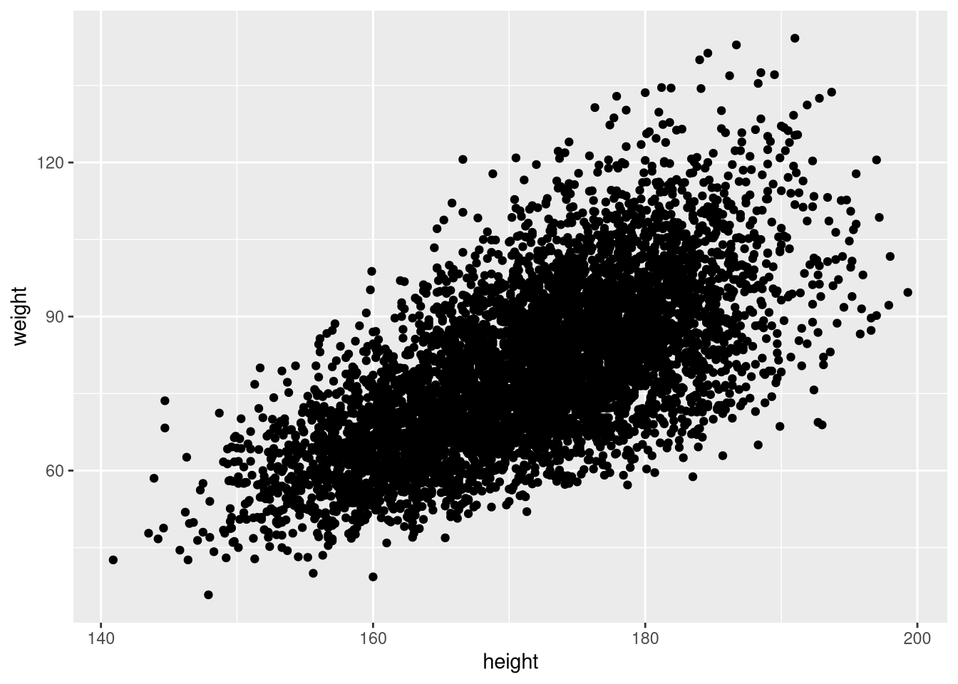
Reduce point size if the plot is crowded:
ggplot(weight_df, aes(x = height, y = weight)) +
  geom_point(size = 0.5)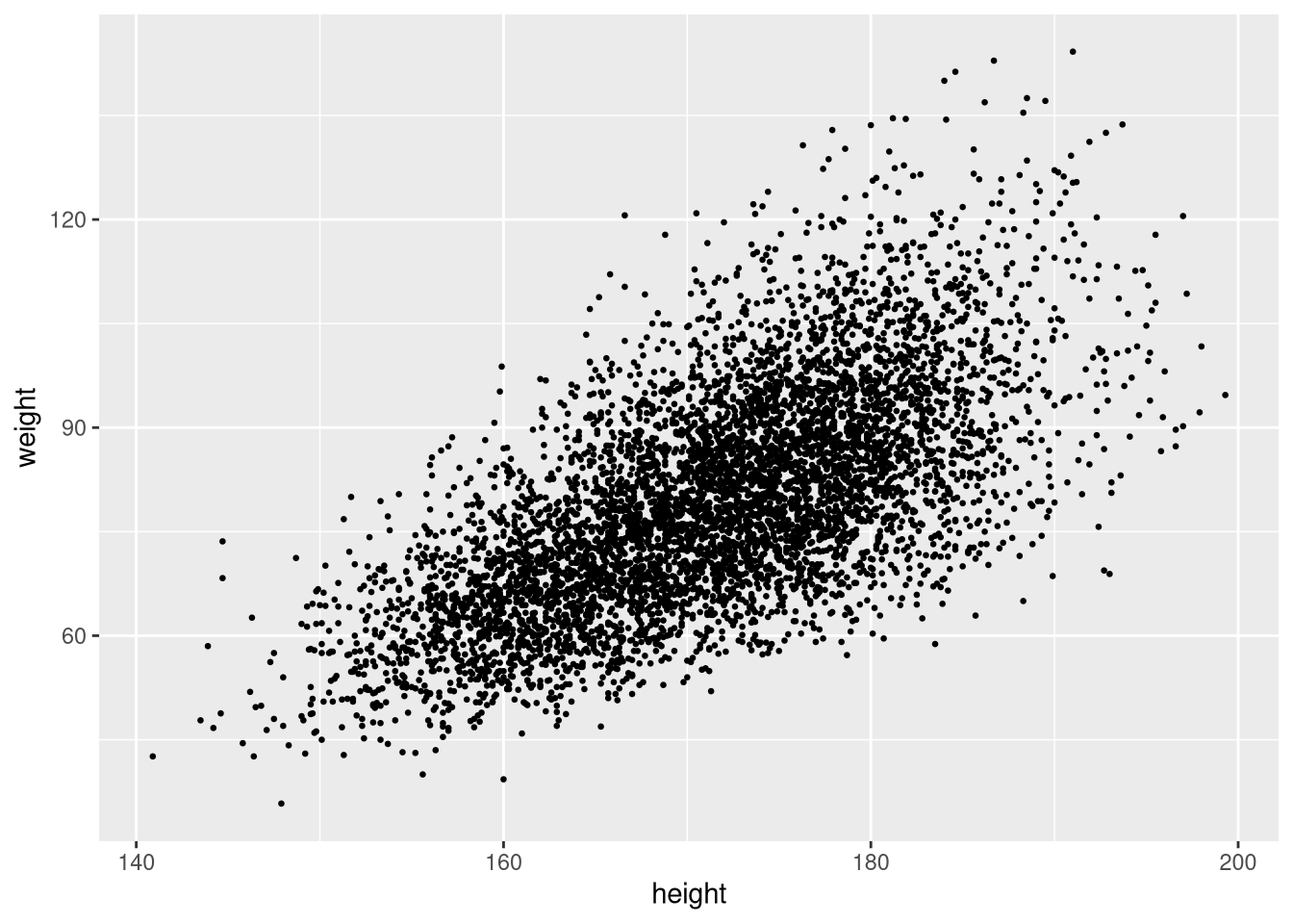
Adding a regression line
Add a linear regression line with geom_smooth(method = "lm"):
ggplot(weight_df, aes(x = height, y = weight)) +
  geom_point(size = 0.5) +
  geom_smooth(method = "lm", colour = "red")
`geom_smooth()` using formula = 'y ~ x'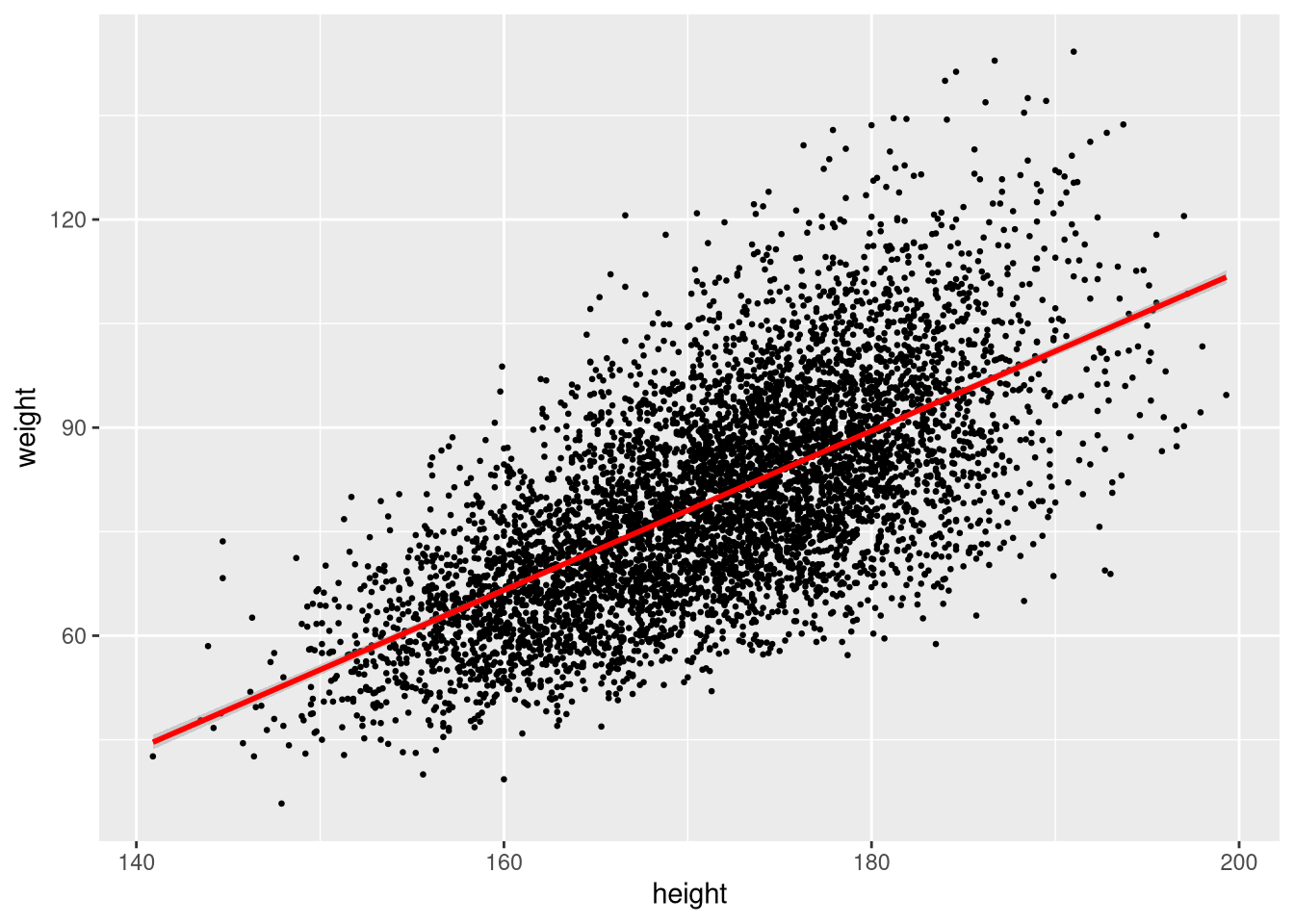
The shaded band is the 95% confidence interval around the fitted line. Turn it off with se = FALSE:
ggplot(sample_n(weight_df, 100), aes(x = height, y = weight)) +
  geom_point(size = 0.5) +
  geom_smooth(method = "lm", colour = "red", se = FALSE)
`geom_smooth()` using formula = 'y ~ x'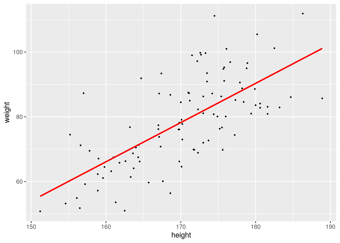
Non-linear smoother
To fit a smooth non-linear curve instead of a straight line, omit the method argument or use method = "loess":
ggplot(weight_df, aes(x = height, y = weight)) +
  geom_point(size = 0.5) +
  geom_smooth(method = "loess")
`geom_smooth()` using formula = 'y ~ x'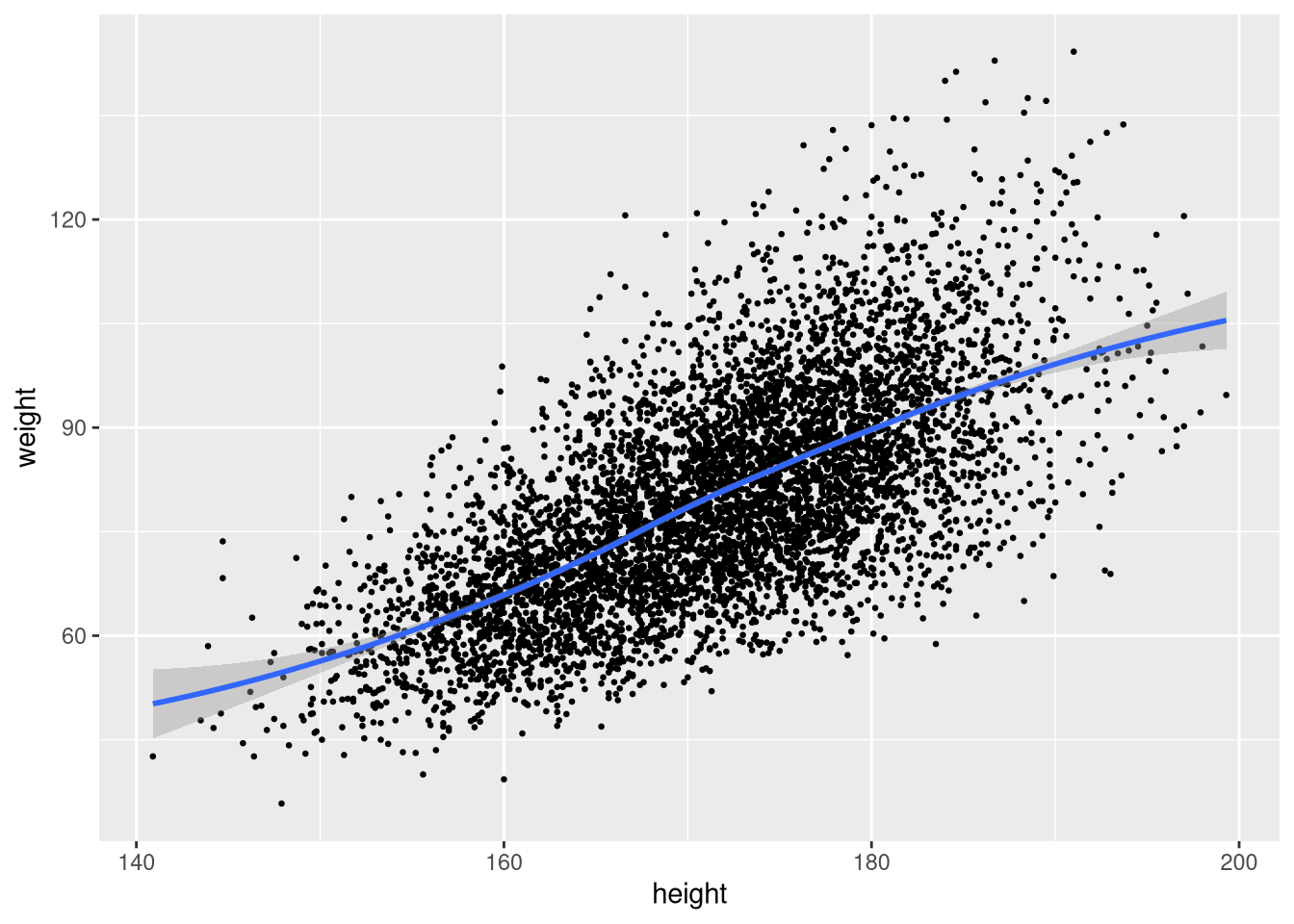
Colour coding by group
Map a categorical variable to colour inside aes():
ggplot(weight_df, aes(x = height, y = weight, colour = gender)) +
  geom_point(size = 0.5)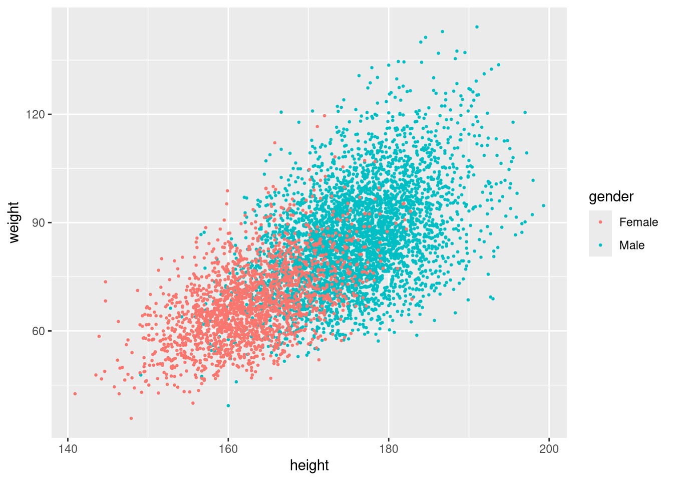
ggplot2 assigns a default colour palette automatically.
Changing the colour palette
Use scale_colour_brewer() to apply a ColorBrewer palette:
ggplot(weight_df, aes(x = height, y = weight, colour = gender)) +
  geom_point(size = 0.5) +
  scale_colour_brewer(palette = "Set1")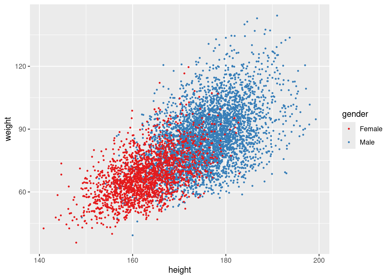
Or specify colours manually with scale_colour_manual():
ggplot(weight_df, aes(x = height, y = weight, colour = gender)) +
  geom_point(size = 0.5) +
  scale_colour_manual(values = c("steelblue", "firebrick"))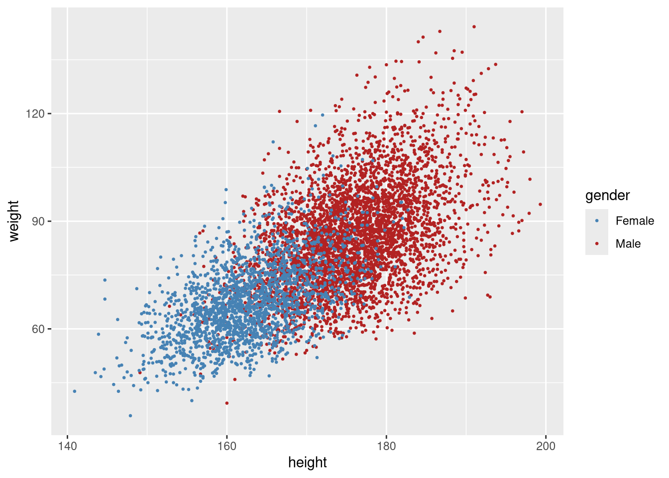
Histograms
A histogram of weight:
ggplot(weight_df, aes(x = weight)) +
  geom_histogram()
`stat_bin()` using `bins = 30`. Pick better value `binwidth`.
The default bin width is usually reasonable but can be adjusted. binwidth controls the width of each bin; colour sets the border colour of each bar:
ggplot(weight_df, aes(x = weight)) +
  geom_histogram(binwidth = 2.5, colour = "white")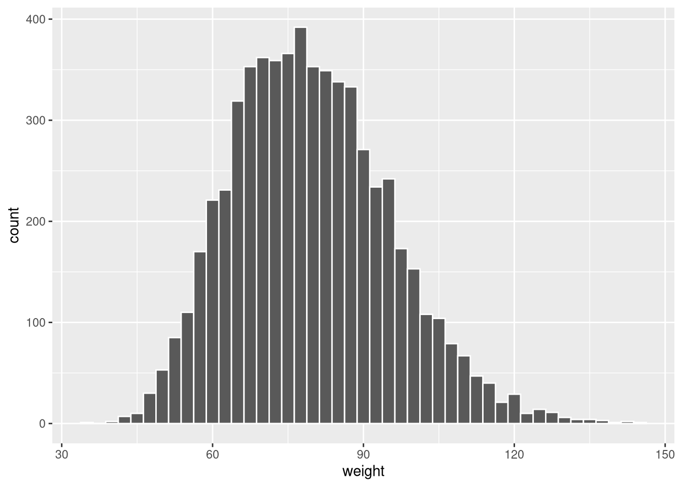
Fill by group
Map gender to fill to show both groups in the same histogram:
ggplot(weight_df, aes(x = weight, fill = gender)) +
  geom_histogram(colour = "white")
`stat_bin()` using `bins = 30`. Pick better value `binwidth`.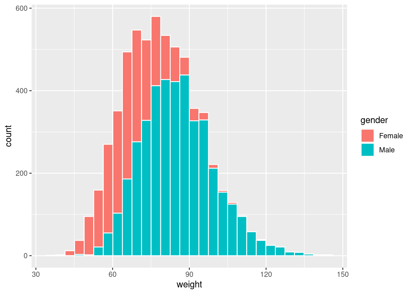
By default the bars are stacked. Use position = "dodge" for side-by-side bars:
ggplot(weight_df, aes(x = weight, fill = gender)) +
  geom_histogram(colour = "white", position = "dodge")
`stat_bin()` using `bins = 30`. Pick better value `binwidth`.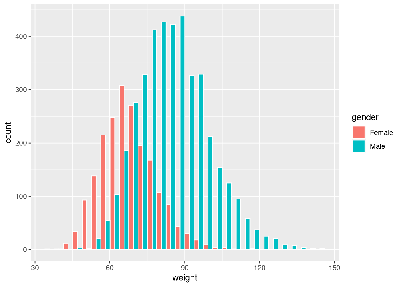
Or use position = "identity" with transparency (alpha) to overlay:
ggplot(weight_df, aes(x = weight, fill = gender)) +
  geom_histogram(colour = "white", position = "identity", alpha = 0.65)
`stat_bin()` using `bins = 30`. Pick better value `binwidth`.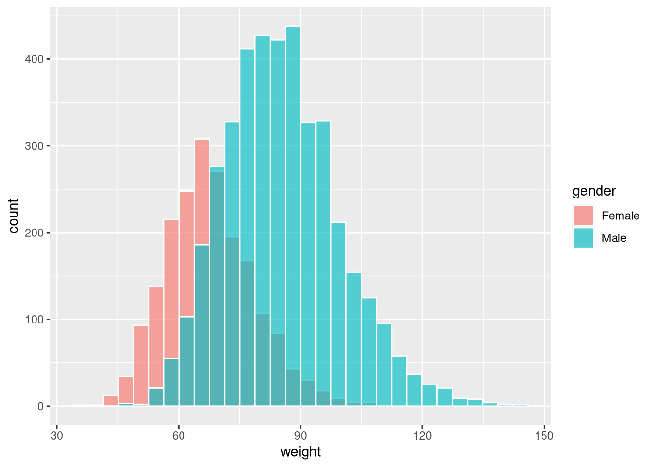
Faceting
facet_wrap() splits the plot into panels, one per level of a grouping variable:
ggplot(weight_df, aes(x = weight)) +
  geom_histogram(colour = "white") +
  facet_wrap(~gender)
`stat_bin()` using `bins = 30`. Pick better value `binwidth`.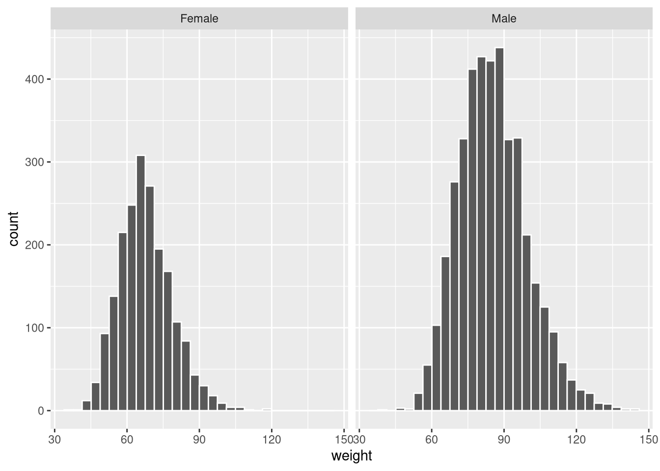
By default, both panels share the same y-axis scale. Use scales = "free_y" to allow each panel its own scale:
ggplot(weight_df, aes(x = weight)) +
  geom_histogram(colour = "white") +
  facet_wrap(~gender, scales = "free_y")
`stat_bin()` using `bins = 30`. Pick better value `binwidth`.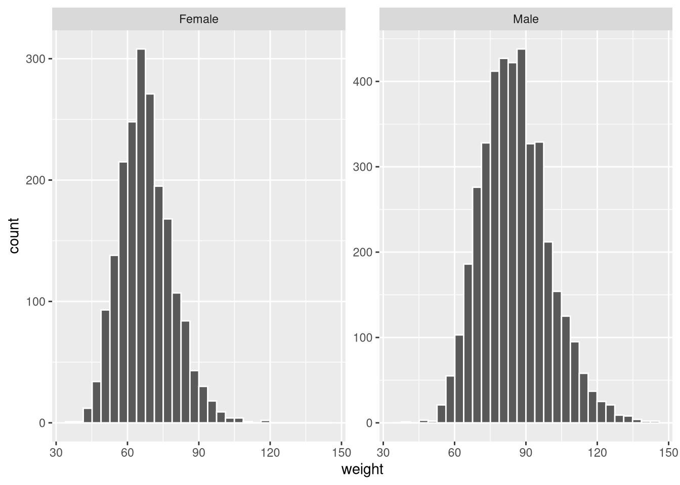
Faceting works with any geom_* and is one of the most useful tools for comparing distributions or relationships across groups.